
aspects (typography)
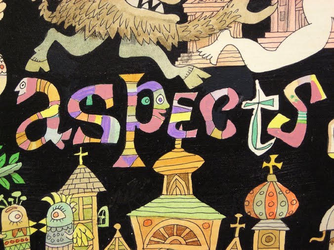 Flora loved experimenting with hand-typography throughout his career, from the 1930s to the 1990s. (Click on tag below to see previous examples.) He occasionally created anthropomorphic letters. The above detail derives from an undated 1990s-era painting entitled The Many Aspects of Love. The large-scale tempera is a lower-tier work reflecting Flora’s libidinous streak with cartoonish figures, a recurring theme which usually makes us cringe. However, the lettering of each word in the tableau demonstrates Flora’s playful approach to the alphabet. We’ll publish the other words in subsequent posts.

