
Filed Under: "details"
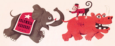
Top half of 1948 Columbia 78 rpm two-disc sleeve, Come to the Circus. The complete cover and interior illustrations were reproduced in The Mischievous Art of Jim Flora. The 2004 book featured most then-known Flora covers from his Columbia and RCA Victor years. We have since discovered others, and are searching for a handful of strays that (based on archival clues) may or may not exist. Rather than include recent discoveries in our subsequent Flora…
Continue Reading... circus cavalcade ►
Quadruped of indeterminate zoological origin; detail, Where Will It All End?, tempera on paper (1993). The full work, previously unpublished, was reproduced in The Sweetly Diabolic Art of Jim Flora (page 66). The rest of the painting is no less disconcerting. Flora was 79 at the time. Many of his 1990s works betray a wobbly hand. Bold ideas continued to flow from the artist’s hallucinatory imagination, but the brushwork was less meticulous than in previous…
Continue Reading... Where Will It All End? ►
Spot illustration, Portrait of a Great American, a 1943 CBS radio trade circular about singer Kate Smith’s prowess raising money for war bonds. Most of the booklet’s illustrations were reproduced in The Sweetly Diabolic Art of Jim Flora, but this perky flower was omitted.
Continue Reading... happy flower ►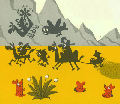
Detail from Flora’s third children’s book, Charlie Yup and His Snip-Snap Boys (1959). Charlie, who wields a mean scissors (his “Snip-Snap Boys” are paper cut-outs), is in the upper left astride Beezer, his “helicopter horse.” For fans—like us—of Flora’s 1950s big-eyed figures, this was the end of the line, his last satisfying children’s book on an artistic level. He wrote and illustrated 14 more, which sold well and charmed generations of young readers. But our…
Continue Reading... Charlie Yup and pals ►
Detail (about two-thirds of the complete work) of an untitled, unpublished tempera on board, ca. mid-1960s. The collection contains a number of similarly composed maritime paintings from this period, though colors and figures vary. If you have our recent book, The Sweetly Diabolic Art of Jim Flora, compare this setting with Salt Pond—Block Island on page 54.
Continue Reading... seaside setting ►
Flora loved experimenting with hand-typography throughout his career, from the 1930s to the 1990s. (Click on tag below to see previous examples.) He occasionally created anthropomorphic letters. The above detail derives from an undated 1990s-era painting entitled The Many Aspects of Love. The large-scale tempera is a lower-tier work reflecting Flora’s libidinous streak with cartoonish figures, a recurring theme which usually makes us cringe. However, the lettering of each word in the tableau demonstrates Flora’s…
Continue Reading... aspects (typography) ►
Absolute good taste edifies absolutely. Cartoonist/animator Gene Deitch, in a 2003 interview with AllAboutJazz.com, about his then-new book, The Cat on a Hot Thin Groove: AAJ: What is your favorite piece of album cover artwork? Deitch: Any by James Flora. Left: detail, Shorty Rogers Courts the Count (1955, RCA Victor)
Continue Reading... good taste edifies ►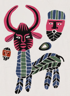
Detail (about one-sixth of the entire tableau), acrylic on canvas, 1992. On the back of the canvas the artist wrote: “Berber Camel Market (a plaque in Morocco).”
Continue Reading... Berber Camel Market ►
Seriously—you’d have to be crazy to play trumpet in this position. You can’t possibly concentrate on your playing. Hopping on one foot, using your left hand to work the horn and the right to tip your hat. You might be an entertaining showman, but from a musical standpoint, this is a caricature of a trumpet player. Seriously. Detail from Flora illustration for The Great Juke, a short story by Marguerite Young, Mademoiselle magazine, October 1947….
Continue Reading... fanfare for the common maniac ►
If you’re planning to attend the above June 10 exhibit — you’re 66 years too late. However, by historical accounts Flora’s first New York City gallery show, held in 1943, was fabulously successful. A few months earlier, Flora had been named art director at Columbia Records, replacing the man who hired him, Alex Steinweiss (at left with the artist in photo below). The whereabouts of the inscrutable petroglyphs on the wall? All will be revealed…
Continue Reading... Flora exhibit at A-D Gallery, New York ►
Tempera and pencil on paper, early 1960s. Another element of a large (16-1⁄2″ x 13-3⁄4″) work partially glimpsed here, and fully revealed in our forthcoming omnibus, The Sweetly Diabolic Art of Jim Flora. Above detail represents about one-sixth of the complete work.
Continue Reading... Venice to Rome (pt. 2) ►
This ship is part of a large untitled tempera harbor montage painted by Flora on a slab of masonite around 1951. How “large”? How much of a “part”? After isolating the above detail, I copied and pasted it horizontally and vertically over the full original to figure out how many elements this size could fit in the complete image field. Outcome: the above detail represents 1/52nd of the entire work.
Continue Reading... ship in silhouette ►
